
Website Font Size: Size does matter
We don’t often get into the nitty gritty of design in this blog. Website font size, however, is significant enough to warrant a special mention.
We’ve been designing websites for about 20 years. In that time, we’ve seen a welcome trend of website font size increasing over that period.
Back before 2000, when many of us were on 13-inch or 15-inch monitors, screen resolutions tended to be smaller. According to w3schools.com (an important site with a user base of web developers), 71% of their users, prior to 2000, were on screens that had a resolution lower than 1024 x 768.
Today, only 4.4% of W3 users have screen sizes with such low resolution. 95% of users use screens that have screen resolutions of 1920 x 1080 or higher. For better or worse, web designers tend to design sites based on their screen resolutions. With that said, the general public has been catching up in terms of larger screen sizes.
Throughout the typewriter era, most designers agreed that 12pt size was an optimal body text font size for printed words. Despite this, paper quantity costs compelled most books, newspaper and magazine typesetters to set their body text font size smaller than 12pt (equivalent to 12px on a Mac).
Throughout the late 1900s and early 2000s, most website designers set their body text font sizes between 9-14px. In the new era of responsive design (e.g. where websites respond to different screen resolutions, especially on phones and tablets), most designers now set their body text font size to 16px as a minimum.
There’s a constant compulsion for many website designers to keep their body text font size below this amount. Why is that? One reason is that many people still think users won’t scroll.
Users scroll. There is no way you’d be reading these words if you didn’t scroll.
Scrolling is so commonplace today (especially with the advent of mobile devices) that it’s become an ingrained behaviour. Even when the content of the page does not exceed the viewport (the immediately viewable area without scrolling), users tend to scroll to see if there’s more content below the area they see.
It’s likely time to increase your website font size
And with an increase in body text font size, comes a need to also increase the size of your header typography (H1, H2, H3 and H4) to suit your larger body text font size.
There are many good reasons to design with bigger body text. Christian Miller, in his excellent and well-detailed essay arguing for larger text sizing, highlighted several significant benefits of designing in larger type, which I’ll summarise:
- Larger website font size works better from a distance – With the advent of smart TVs and HD displays, the user could be anywhere between 3 and 16 ft away from the screen.
- Larger website font size improves readability – “A larger typeface has been proven to enhance readability for all types of users, regardless of one’s age or quality of eyesight”.
- Larger website font size improves usability – it can “minimise clutter, reduce extraneous cognitive load, and result in improved usability.”
- Larger website font size increases visual impact – “Larger font sizes on headlines can elicit a much stronger emotional connection, and the same applies to body text. Words can appear more prominent. Messages become louder, confident, and have more conviction.”
We’ve set our body text font size to 19px with a line height of 1.76 and a default letter spacing. Our headers are consequently larger, as follows:
| Header Style | Header Text Font Size |
|---|---|
Header 1 |
40px |
Header 2 |
35px |
Header 3 |
30px |
(NOTE: Want to see how your practice marketing measures up against the best in class? Take this 5-minute quiz to see how you stack up in the 9 areas of practice marketing and get specific tips and advice on how you can improve your weak points and better leverage your strengths).
We’re not getting any younger
One very important reason for increasing website font size is presbyopia. As every ophthalmologist knows, everyone starts to feel the effects of presbyopia around their mid-forties. Reading glasses become necessary and they’re not always around when you need them. I’ve got it now, so I can clearly (and sometimes blurrily) empathise with many of our readers over 40.
Over the last couple of years, I’ve also found reading my business cards to be a challenge, which is one reason we increased the font size for them as well, as you can see in the comparison below.
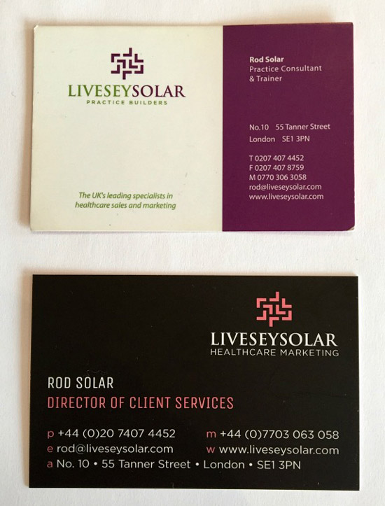
The battered old card at the top was perfectly legible in my 30s. The black card below it reflects our interest in making our cards more readable. The difference is clear.
Let us know if you’ve noticed this trend towards increasing text sizes. Have you taken action and increased your website’s text size? Join in the conversation by leaving a brief comment below.
About the author

Rod Solar
Founder & Scalable Business Advisor / fCMO
Rod Solar is a co-founder of LiveseySolar and a Scalable Business Advisor for its customers. Rod mentors and coaches eye surgery business CEOs/Founders and their leadership teams to triple their sales, double their profit, and achieve their “ideal exit”.
Related Posts
Meet our Co-Founders

Rod Solar
Founder & Scalable Business Advisor
For over 20 years, I’ve helped ophthalmology entrepreneurs scale their private practices. I specialise in doubling revenue within three years by offering a proven framework, hands-on experience, and a team of experts who implement what works. We take the guesswork out of growth and scale, so you can focus on delivering exceptional patient care while maximising the value of your business.
LiveseySolar completely transformed the way we were approaching this… We’ve gone from having just the dream of having a practice to having a practice up and running with people making inquiries and booking for procedures… It’s extremely pleasing. We feel lucky we connected with LiveseySolar.
— Dr Matthew Russell, MBChB, FRANZCO, specialist ophthalmic surgeon and founder of VSON and OKKO

Laura Livesey
Founder & CEO
I’m the co-founder & CEO of LiveseySolar. I’ve developed powerful eye surgery marketing systems that increase patient volumes and profits for doctors, clinics, and hospitals, since 1997.
Rod and Laura know as much about marketing surgery to patients as I know about performing it. They are an expert in the field of laser eye surgery marketing. They know this industry inside out. I believe that they could help many companies in a variety of areas including marketing materials, sales training and marketing support for doctors.
— Prof. Dan Reinstein, MD MA FRSC DABO, founder of the London Vision Clinic, UK


