Don’t make your website visitors think!
My father-in-law used to say that signmakers were art-school dropouts. They may not be the most creative artists, but they sure do know how to efficiently communicate.
For example, do you notice that stops signs look similar almost wherever you are in the world? That’s because the goal of a stop sign is to tell people who are in a hurry that they need to stop. As a result, there’s little room for creativity or expressing one’s individuality for stop sign makers.
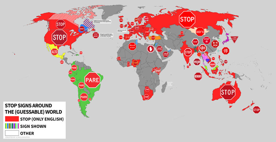
Figure 1 – Stop Signs around the world
It’s a good thing that stop signs look similar wherever you are in the world. We’re talking about life and death here – they don’t have time to make drivers think!
One of the best ways to make something simple to understand when someone is in a hurry is to use familiar conventions.
Another place that needs to give clear directions to people in a hurry is a website.
Website conventions are your friends
Let’s have a look at some common website conventions that I’m sure you’ll recognise.
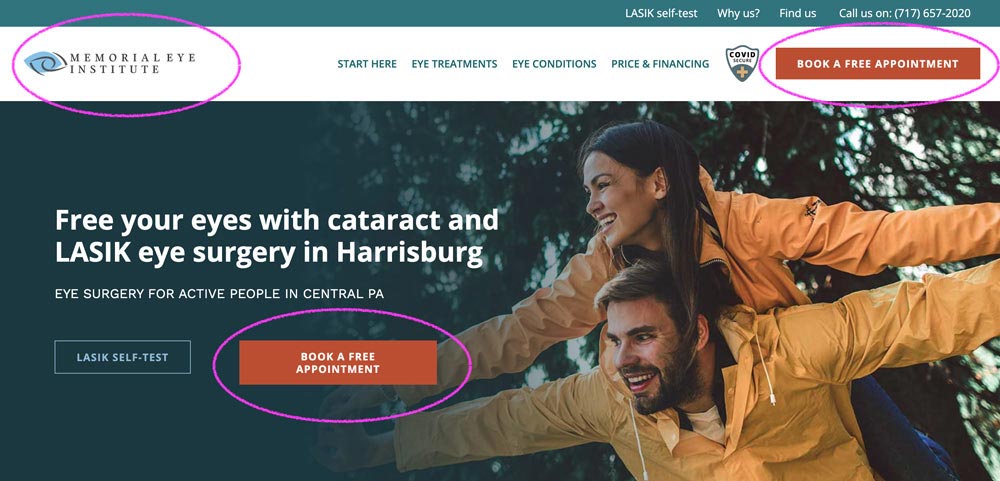
Figure 2 – Website Conventions – Logos and Call to Action buttons
Since the early ‘90s, many web conventions have evolved. As users, we have expectations about:
- Where certain things will be on the page. For example, users expect to see a logo on the top left corner (at least in the West). And, we expect that logo to go “home” when you click it. They also expect navigation to run along the top as it does in the above screenshot. (Figure 2)
- How things work. If a word or phrase is in a button, it’s likely that the user will understand that pressing the button will help them do what the phrase implies (e.g. “book a free appointment”) as you can see above. (Figure 2)
- How things look. Most search boxes look like search boxes, like the one below in Figure 3. Most links are a different colour than the rest of the body text. (Figure 3)
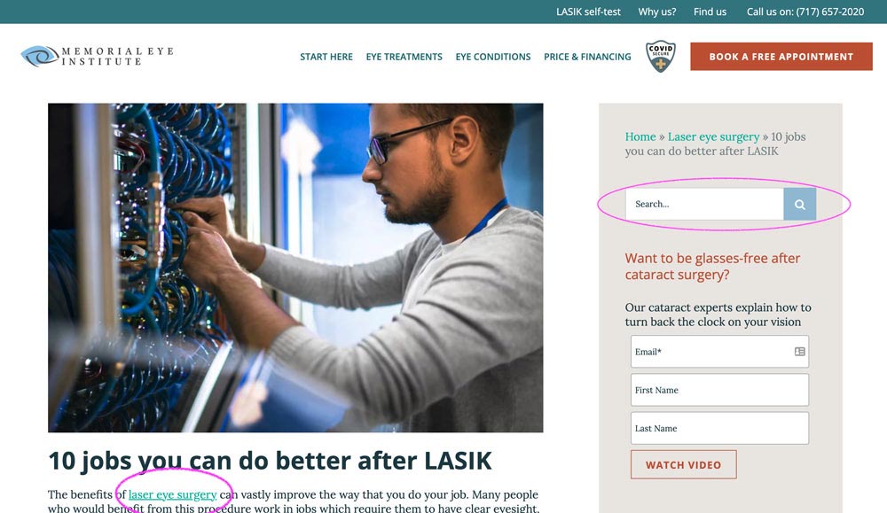
Figure 3 – Website Conventions – links and search boxes
These conventions didn’t arise spontaneously. They all started as somebody’s bright idea.
If the concept works, other site designers will imitate the idea. Eventually, the idea becomes so common that it needs no explanation.
Thus, web conventions make life easier for users because they users to not have to work as hard to do what they want to do. In addition, they know what to expect from one site to the next.
1For more on web usability best practice, see Don’t Make Me Think, Revisited, A Common Sense Approach to Web Usability Copyright © 2014 Steve KrugMarketing best practice is your guide
When designers design a website to meet a purpose (i.e. to get leads), they follow standardised best practices. So how do you know you have a site that a designer has designed with best practices in mind?
Examine these sections of your home page.
A. Top Section
The headline or sub-head, supporting imagery, and call to action must immediately and clearly answer the questions:
- Who is this for?
- What problem does it solve?
- What do I need to do next?
B. Imagery
The leading (also known as “hero”) image positions the customer as the hero and clearly demonstrates the ideal “After” of the target market. All additional images support the themes and messages in the sales copy.
C. Top Menu
The company logo is visible (and typically on the top-left corner), navigation is limited to bare essentials, and the primary call to action holds a prominent position on the top-right of the page (typically set as a button).
D. Call To Action
The page maintains a consistent primary and secondary call to action and repeats these Calls to Action (CTAs) at least 3 times (Top Menu, Above the Fold, Below the Fold).
The CTA copy is clear and compelling, and the visitor knows the EXACT action they need to take (e.g. Click a button, fill out a form, call a number, etc.) to progress to the next step.
E. The Body
Text, images, and video clearly and succinctly expand on
- HOW the product/service works,
- WHO will benefit, and
- WHAT the visitor needs to do next.
The sections are clearly labelled, and the copy is compelling and persuasive.
F. Trust
Impressive logos from associated organisations are featured prominently on the page. Customer stories and quotes are visible or immediately accessible from the home page.
G. Footer
In addition to all essential information (e.g. expanded navigation, physical address, links to contact us, Terms of Service, Privacy Policy, etc.). The footer also serves as a resource directory for flagship content and case studies.
How did your website fare? If it isn’t aligned with best practices, it’s likely to fail to meet its goal.
Here’s an example of these best practices in action in Figure 4 below. The letters and the coloured sections in the image that relate to each best practice we list above.
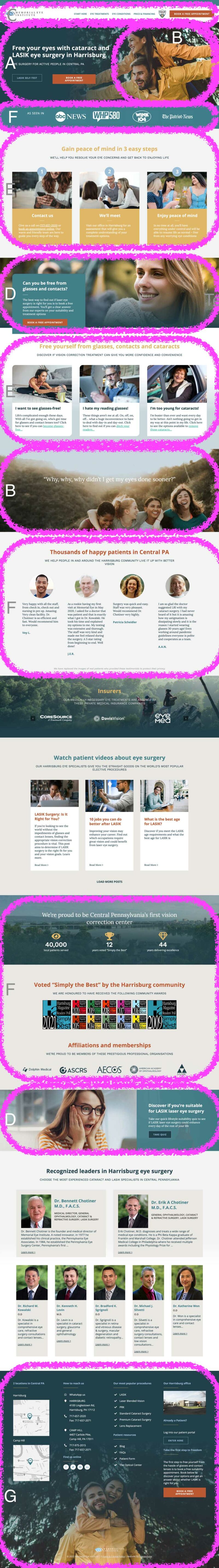
Figure 4 – Website Design Best Practice
The problem with familiar conventions and best practices
One problem with website conventions is that designers are often reluctant to take advantage of them.
Faced with a design challenge, designers often feel tempted to reinvent the wheel instead.
Often, they feel that their clients hired them to “do something different”, and often, that’s what their client asked them to do.
Designers also want their body of work to demonstrate that they are “out of the box” thinkers and can be “innovative” enough to have a “diverse portfolio”.
Unfortunately, this is an irony in many creative pursuits. While “thinking different” may get more work, there’s no guarantee that it get better results.
Rarely, “out-of-the-box” thinking results in a revolutionary new approach to doing the same old thing. Unfortunately, however, this type of thinking more often results in time spent reinventing the wheel.
Often, designers (and their clients) don’t know (or ignore) best practices. Sometimes, they don’t know the goal.
The primary goal of any website we design is to convert visitors into leads
All other goals are secondary.
Secondary goals may include:
- Educating visitors about conditions and treatments
- Sharing the breadth of the provider’s services
- Impressing peers and colleagues
- Selling the core offer
- Branding with attractive images of facilities or personnel
- Satisfying departmental power-struggles
You can, of course, choose a different primary goal than the one we recommend – but at least choose one. Know that when you aim to please too many cooks, you’ll spoil the broth.
Rule No. 1 – Don’t make your web visitors think
There are a few occasions where it’s important to be creative and different. These are
- Your content. For one website, our client asked us to just copy and paste from AAO’s Eye Guide for Patients and the Public. They had a membership, after all, that encouraged them to do so. Unfortunately, that’s terrible advice. Google will rarely highly rank content that it’s already indexed elsewhere. So, unless you don’t care about SEO, don’t copy and paste content – even if you have permission to do so.
- Your sales copy. Your copy needs to persuasively articulate the transformation from your specific avatar’s before to their after state. While some of your copy might appear similar to what appears on other sites, the best copy laser focuses on articulating a specific avatar’s customer journey.
- Your imagery. Unless you have a budget to hire a photographer, you’re going to need to rely on stock photography. However, you needn’t accept that standard stock fare that populates 80% of vision correction websites. Your designer’s job, in part, is to curate a collection of stock photography that supports your brand and further emphasises the characteristics of your ideal patient. Ideally, it should feature your specific avatar’s struggles and concerns and their hopes and aspirations. That doesn’t mean you must only have completely unique images that no one has ever used before. You should, however, avoid using stock imagery that your competitors are already using.
Pretty much everything else should follow standard conventions and best practices, as I’ve described in the body of this post.
If you look at our website portfolio, you’ll notice that MOST of the websites we design follow these conventions and best practices. That’s not being lazy. That’s being smart.
Where our work deviates from convention and best practice, somebody tried to be “creative”. Most of the time, it was the client. But, I regret to admit, a few times, it was us. After all, we’re also human.
After you’ve designed everything aligned with convention and best practice, THEN you can tweak and test to see how to improve your results with your specific audiences.
Again, your aim is not to be “creative”. Your purpose is to achieve your goal (i.e. not making users waste unnecessary calories on their way from visitor to lead). For vision correction, the goal of your website should be to convert visitors into leads.
NOTE: The best way to answer that nagging question about practice growth or marketing or patient volume in the back of your mind is to book a free 15-minute compatibility call. Get some options and go away with a clear idea of what’s possible.
About the author

Rod Solar
Founder & Scalable Business Advisor / fCMO
Rod Solar is a co-founder of LiveseySolar and a Scalable Business Advisor for its customers. Rod mentors and coaches eye surgery business CEOs/Founders and their leadership teams to triple their sales, double their profit, and achieve their “ideal exit”.


Meet our Co-Founders
Rod Solar
Founder & Scalable Business Advisor
For over 20 years, I’ve helped ophthalmology entrepreneurs scale their private practices. I specialise in doubling revenue within three years by offering a proven framework, hands-on experience, and a team of experts who implement what works. We take the guesswork out of growth and scale, so you can focus on delivering exceptional patient care while maximising the value of your business.
LiveseySolar completely transformed the way we were approaching this… We’ve gone from having just the dream of having a practice to having a practice up and running with people making inquiries and booking for procedures… It’s extremely pleasing. We feel lucky we connected with LiveseySolar.
— Dr Matthew Russell, MBChB, FRANZCO, specialist ophthalmic surgeon and founder of VSON and OKKO

Laura Livesey
Founder & CEO
I’m the co-founder & CEO of LiveseySolar. I’ve developed powerful eye surgery marketing systems that increase patient volumes and profits for doctors, clinics, and hospitals, since 1997.
Rod and Laura know as much about marketing surgery to patients as I know about performing it. They are an expert in the field of laser eye surgery marketing. They know this industry inside out. I believe that they could help many companies in a variety of areas including marketing materials, sales training and marketing support for doctors.
— Prof. Dan Reinstein, MD MA FRSC DABO, founder of the London Vision Clinic, UK